The very moment Google publicized Material Design at Google I/O conference in 2014, we witnessed an ongoing debate if the Material Design is better than Flat Design. What makes them different and which one is more preferred?
As Flat Design shares some similarities with Material Design, most people usually confuse the two. But, there are numerous factors that make one distinctive from the other, both in terms of positives and negatives!
For the web world, design is like bait. These user interface designs have always been influenced by an array of trends, especially in recent years. In this article, we will discuss which of these user interface designs is the best. Should you continue with the Flat Design or is it time to move to Material Design? What are the similarities between the two? Before we dig deeper into the underlying differences between the two user interface designs, let us first have a look at the fundamentals of each of them separately.
Apple's Flat Design
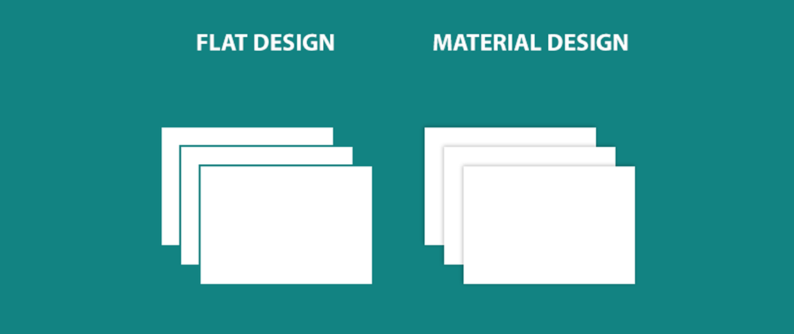
Flat Design, in some ways, is the design that is stripped down to the fundamentals. The design has no stylistic choices that would give the illusion of three-dimensionality such as gradients, drop shadows or textures. The main focus of Flat Design is totally on the interplay of icons, color, and typography.
Flat icons look simple and nicely decorate the webpage while assisting users with easy navigation throughout the page. In other words, Flat Design is more like an evergreen trend that is made to stay. Flat Design is considered the opposite of skeuomorphism. It does not use real-life imagery just like Skeuomorphic Design and uses two-dimensional visual details.
Just like Material Design, Flat Designs doesn’t employ shadows. It symbolizes the digital landscape from where it arose. While other design systems depend on realism and metaphor to convey their true essence, this design strategy is disregarded by Flat Design and is referred to as authentically digital. Since Flat Design and minimalism go hand in hand so many Flat Designs look intentionally sparse.
Google's Material Design
Material Design was introduced by Google. It offers grid-based layouts, animations, padding layouts, and takes responsiveness into account. It is a highly flexible user interface in comparison to other designs.
The digital material can easily be reformed and expanded intelligently, unlike real paper. It has physical edges, surfaces, shadows, and seams that produce an illusion of what you can actually touch. Google introduced Material Design to build a practical, coherent and accessible visual language.
The fundamental design principle was to translate all the physical properties related to a paper, on screen. The main goals on the basis of which Material Design is created are: build a language that completely synthesizes classic design principles and establishes a unified system that must be deployed on across multiple devices and platforms, keeping mobile as a fundamental device.
Nonetheless, Google Material Design can be referred to as the branded product having well-defined principles and guidelines. The basic idea of introducing Material Design was quite obvious i.e. to bring intuitiveness that the Flat Design was lacking.
To give the concept to Material Design in a nutshell — imagine holding a piece of paper that can expand or contract at your will. It can fuse, reshape itself and divide. Now simply stack some of these papers on top of each other and allow them to levitate. Make a site element on each of these papers. This is what Material Design is. It is also created keeping in mind that it should be universally adaptable and must be responsive to all screen sizes as well as shapes like Android Wear watch.
Flat and Material Design - Positives & Negatives
Here are the advantages and disadvantages of Flat and Material Design that makes them distinctive from each other.
Flat Design:
Pros:
- The flat design embraces and works within the screen limits.
- This design strategy works best to decrease the loading time as it streamlines designs and avoids unnecessarily animated or graphical elements.
- It has a few skeuomorphic elements that help readers in speeding up progression across the content.
- Eliminate all useless and unnecessary design selections, support simple and faster website design.
- The simplified sites embodying flat design are endlessly adaptable and are highly easy to be made responsive.
Cons:
- The design strategy is limiting and keeps you constrained to simple shapes, colors, and iconography.
- When you use Flat Design it simply lets you create a very generic looking and featureless site.
- Some apps or sites need complex visual cues for user guidance through the process. This is one of the biggest failing points of Flat Design. Also, another common complaint is the lack of drops shadows along with raised edges, making it difficult to differentiate clickable buttons from other static vector graphics.
- There is a lot of ubiquity making it difficult to create some original-looking Flat apps or websites.
- On a more related note, it has mid 2010s aesthetics and you will need to redesign the site again quite frequently.
Material Design:
Pros:
- Material Design offers a particular set of guidelines in a detailed manner.
- If you wish to develop things for various platforms, it provides a unified experience across all devices that bring more user-friendliness and also help your branding.
- If you are more into integrating animations, you definitely need to go with Material as it offers numerous built-in ones that would otherwise need to be done manually.
Cons:
- Material Design is inextricably linked with Google. It is really difficult to distance yourself from it and to create an absolutely unique identity for your app or website. You can take the help of Google guidelines for this.
- Not every system can pull off the desired frame rates.
- The animation can be hard for the batteries of mobile users.
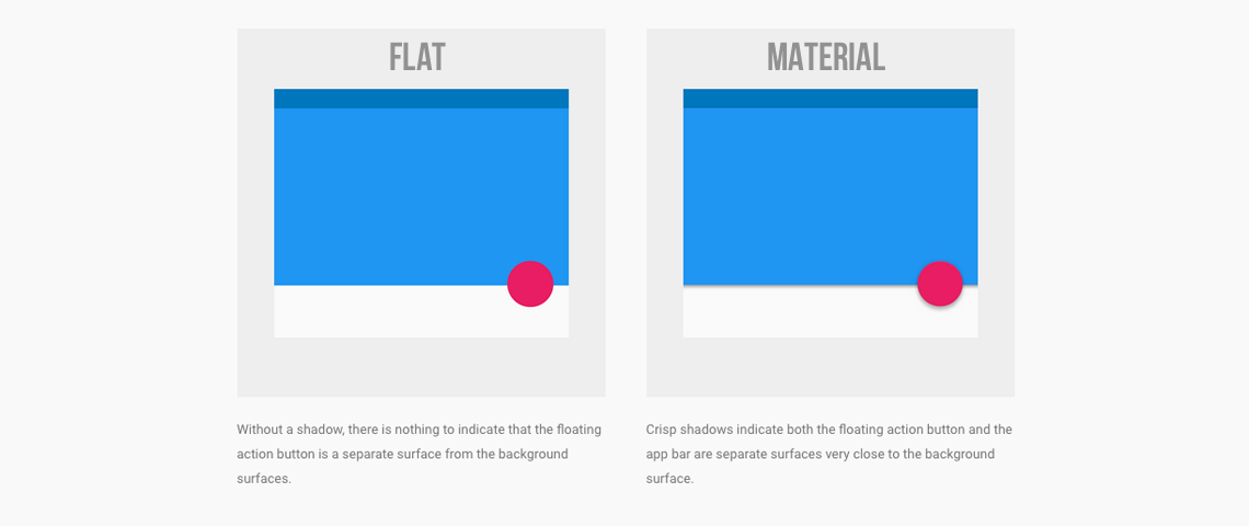
Flat Design vs. Material Design - Depth
The way Apple and Google look at the interaction of devices and applications is really different. Both of them have different opinions about it. Apple believes that mobile screens/devices are more like a window into some other world that embraces infinite depth in terms of application.
Google sees it in another way. It assumes that users must interact with the elements as if they are stacked on each other. The users must get the feeling of holding the screen in their hands.
Flat Design vs. Material Design - Navigation
For the better user interface, navigation is a must-have element. This means organizing the structure of the app according to the tasks and contents that users like to see. Material Design offers fewer navigation rules and offers a higher level of flexibility for designers. Google offers a number of components and an action button that easily reveal various options.
On the other hand, the navigation system of Apple is easy to use and understand. Their concept revolves around having an app that has less than five features and forces designers to ponder over the functions of their app. Thus when it comes down to UI features, Apple and Google like to be different in their approach and preferences.
Flat Design vs. Material Design - Responsiveness
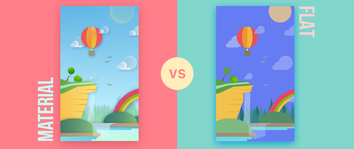
Responsiveness is another must-have element of a great UI experience. Material Design offers high responsiveness. It easily goes inflow along with the user’s preferences and actions. This is similar to the real world pattern.
Flat Design, on the contrary, lacks responsiveness. It is not similar to the real-world experience and offers a reclined (black and white) digital communication.
Material Design or Flat Design?
The question still remains the same — which one of them is a better option in terms of a design choice! Should you use just one of the design types and completely disregard the other?
Well, the answer is No! They both are distinctive and have their own place in terms of purpose and what you wish to build. To put it in simple words, classic Skeuomorphic Design is a simple imitation of how things were or used to be – a realistic idea of the real-world elements that make design interface feel familiar.
Flat Design works in a minimized environment that heavily relies on the familiarity of the user with the UI design overall and avoid any element that is not purposeful or serves an intended function.
And finally, Material Design aims to combine a few ideas from Flat Design and Skeuomorphic Design. This was a well-planned concept that offers an interface that is highly optimized for digital and also reminds of the real world while making the interface intuitive.
Nonetheless, if you need a user-friendly, simple and practical website then Flat Design should be the first choice. Flat Design is more about having raw simplicity and functionality whereas in order to get a fancier interface with complex graphics and animations you should definitely go with Material Design.
Further reading:
Best design and prototyping tools


