Around 87% e-commerce professionals and digital marketers agree with the fact that design-driven organizations easily outperform competitors and other businesses!
Regardless if you run a small or large business, a website is the first platform to introduce your business. But not all business owners pay attention to have a website. Similarly, some only have an old or even half-put-together website just to have an online presence for their business. Despite the size of your business, ensuring an online presence in highly imperative in today’s competitive business industry.
A website is crucial to reflect how and why you are presenting your business to the target market. And for this, you not only need to have a website but the one that is designed for the purpose. A well-designed website consistently conveys the brand; it tells your visitors what your business offerings are and leads them to take the action you want them to take.
In other words, a good web design can make or break your business. Consider it as the face of your company, thus, it is highly important to keep up with the latest trends. In fact, if you have been a frequent user of the internet, every once a while, you will come across a website that would really make you stop for a second and think. Some of these great web designs push the boundaries of everything that is possible on the web. A good web design might tap into the following elements to make it unique and distinctive:
- Usability
- Aesthetic
- Interactivity
- Sound design
In addition to that, it may also include the value that the website provides. All of these elements help design a masterpiece - a website that will inspire!
While many businesses still follow the same old and tired templates, they do establish an online presence but with a predictable approach. It is not bad to follow a traditional website template but it is not the smartest way to go about it. In modern business industry, a website that takes longer than 3 seconds to load can be a game changer.
That is why a good web design significantly impacts the bottom line of the business. When you take a distinctive approach to design a website, it helps you create something that would break the mold but without shattering user experience.
To help surface the most inspiring website designs, we have gathered ten most popular websites!
As you go through these uniquely designed websites, you will know that each one of them excels in its own way. These web designs seek to serve a different and unique purpose. Maybe one website is the excellent example of aesthetics and visual design, another is the best example of interactivity.
This does not mean that all of these inspiring websites are ‘conversion machines’ or even blueprint ideas that one can easily copy over to design their own website. Rather, these websites give you an idea of great ways in which you can gain web design inspiration and observe the cutting-edge marketing, happening all over the web.
So let’s have a look at the top ten web designs that are an excellent example of the look and feel of a stunning webpage.
Design #1 – Heco Partners
The layout of this website is based on a full bleed hero that flows into staggered two-column sections along with scroll-triggered animations in the background.
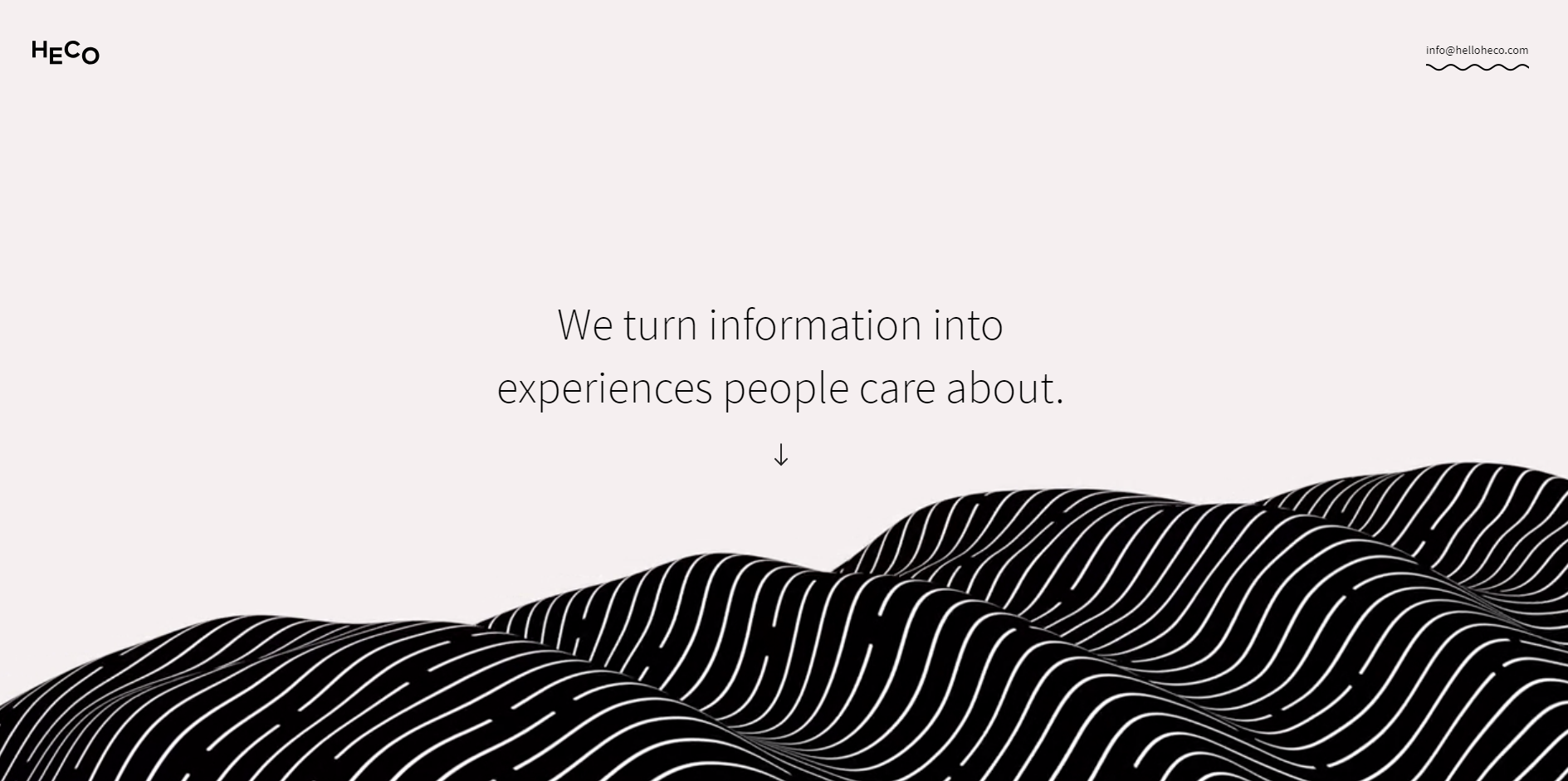
This is a web design you can’t get enough of! As soon as you land on this website, you will encounter words like; ‘we turn information into exciting experiences that people really care about’. The text is hovering above the undulating wave. The website creates the design by using two-tone colors. This might not sound like a convincing or inspiring style of web design but until you see or use the website.
The web design elements that are combined in this web layout symbolize the promise of transforming business ideas into actions. When you don’t even scroll, you get the strong sense of the business and its offerings. In fact, it is one of the most distinctive and simple ways to describe who you are as a business and what you do.
Design #2 – The History of Climate Change
It is one of the award-winning websites. The history of climate change follow the Luc Jacquet footsteps as Wild-Touch takes you on this interesting, educational and visual journey about the long history of climate change, globally. The web design of this website is the fine mixture of unique animations and historical media that help tell the story in the most interesting manner.
.jpg)
The website incorporates the web style of cartoon drawings and illustrations that can easily bring your web design to life. By definition, the design itself is a creative activity and simply by incorporating it into your website, you can create one of the most unique and creative methods to present information on the web. There could be countless varieties of this style. In fact, the style is only limited by the imagination of the web designer. It could be both, a vector-based imagery or hand drawn.
Design #3 – Bike Time Bali Road Bike Camp
This web design is a great mix of minimal graphs, gorgeous photos, and brief paragraphs. This web design immerses the visitor in cool experiences as well as the terrain you would ride through when you attend the road bike camp.
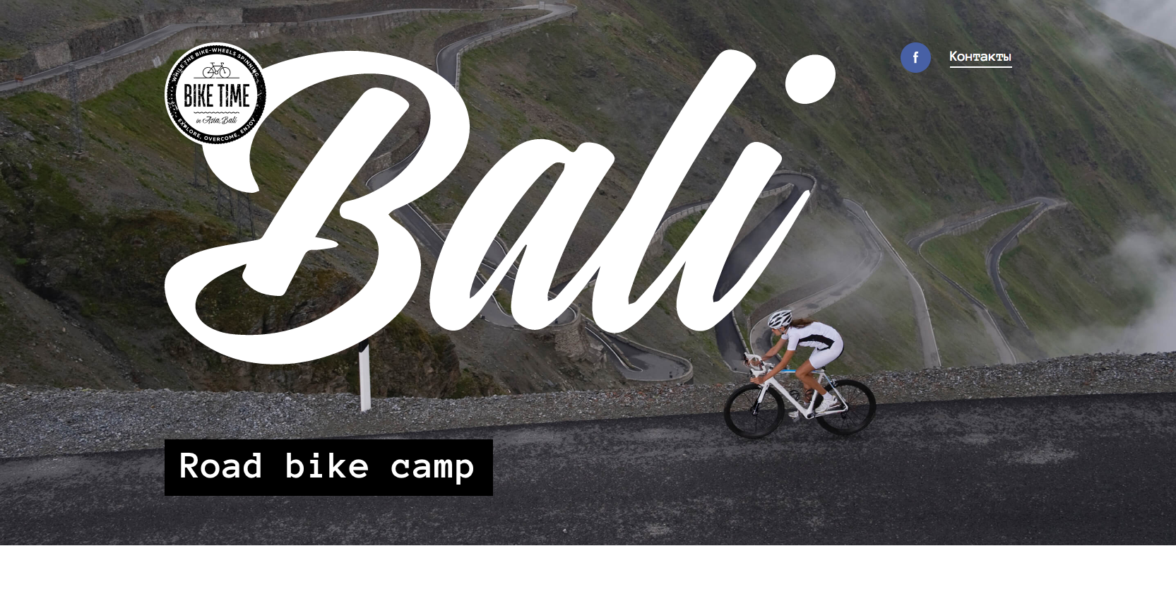
The web design incorporated photo-realism style. It is the technique to make everyone familiar with almost immediately and purely because of the linked realism. The logo of Bali echoes the road movement on an image beneath. While this design element may have been distracting it does play nicely off the mountain winding road. The design shows amazing beauty of that area, being heavy on the photograph. The various size text, some much smaller and some drastically large, make it even more appealing in a unique way.
Design #4 – Minimums
Minimum takes up a grid-based design for their website. Indeed, they selected a quite bold approach in terms of how they displayed the content. The website incorporates the Transparency web style. It is one of the great ways of making the text a lot more readable as it is placed above the images.
.jpg)
When you choose this web style, it also preserves the image part that lies below the text, thus, the full image can also be seen up to certain degrees. The website incorporates full-width and high-quality images along with big typography. What makes this website unique is that it serves as one of the best examples for how to nicely execute a conventional grid style website while still maintaining a very nice and vivid visual hierarchy in terms of overall design patterns. Not to mention, transparent style grid web design is the most viable style followed by many business websites.
Design #5 – Superimpose Studio
The basic layout of the website involves a cube that pushes into the screen along with a revolving carousel of thumbnails that forms the border. With this layout, this website truly jumps beyond unique and land into experimental territory firmly. The design simply takes the conventional portfolio grid and quickly stretches into three dimensions. This creates a rotating frame of graphic surrounding the studio’s name.
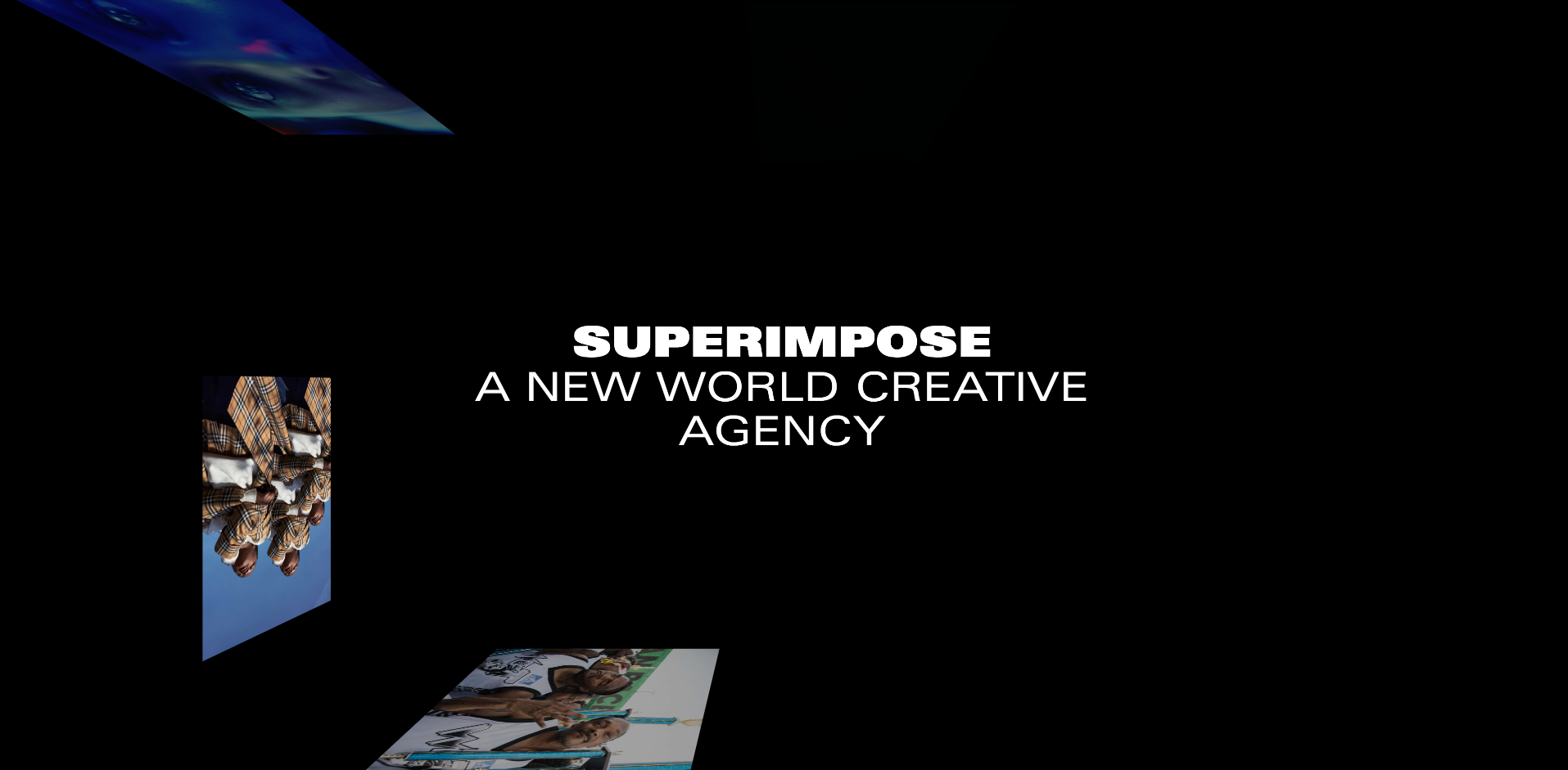
To navigate the website, you need to click on any of these rotating images and you will be directed to the detail page of the project. This easily rotates the carousel of the homepage so that images can easily scroll vertically. The web design is definitely an artful and memory-intensive design.
If you go through the modern web designs there are many artistic and experimental portfolios. This is one of the most unique ways to frame the content of the website and works best for studio businesses to fully deliver their innovative approach.
Design #6 – The Loneliness Project
If you want to have a look at a web design that incorporates illustrations or textures then check out the Marissa Korda’s passion project website. The website is designed to display stories of loneliness from individuals from all walks of life and ages. It is an interactive web style. To make it more appealing and symbolizing, the web design is based on animations, illustrations, and sound that help in crafting a fully interactive and immersive user experience.
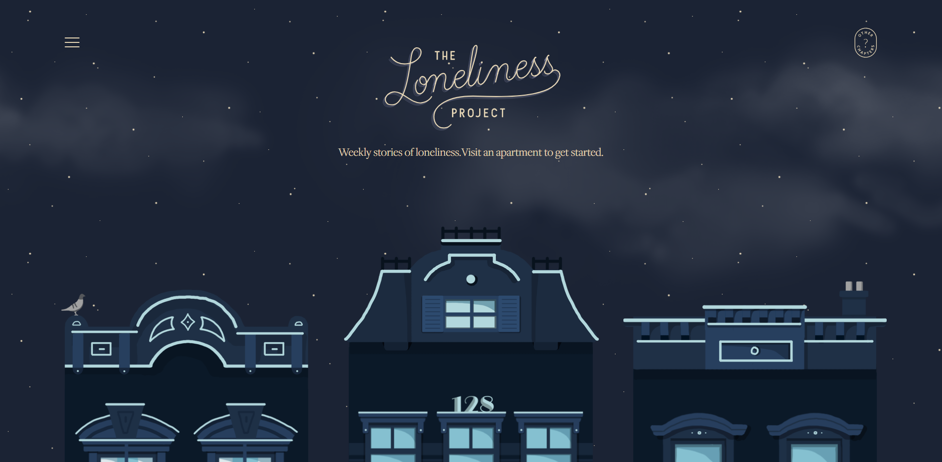
This layout encourages visitors to fully immerse in the presented stories. This illustrative web design helps to reduce the gaps between storytellers and the visitors. Patterns, textures or illustrations are the best way to add great depth to the web design. Usually, the design comprises a big background image.
Design #7 – Peerspace
This website has a full-screen cover that transition into basic two broken grid segments that lead to furthermore rigid grids. The website aims to link other entrepreneurs and short-term spaces. Regardless if it’s the location for the video shoot or a pop-up shop, the layout of the Peerspace make the entire process quite easy for securing a location.
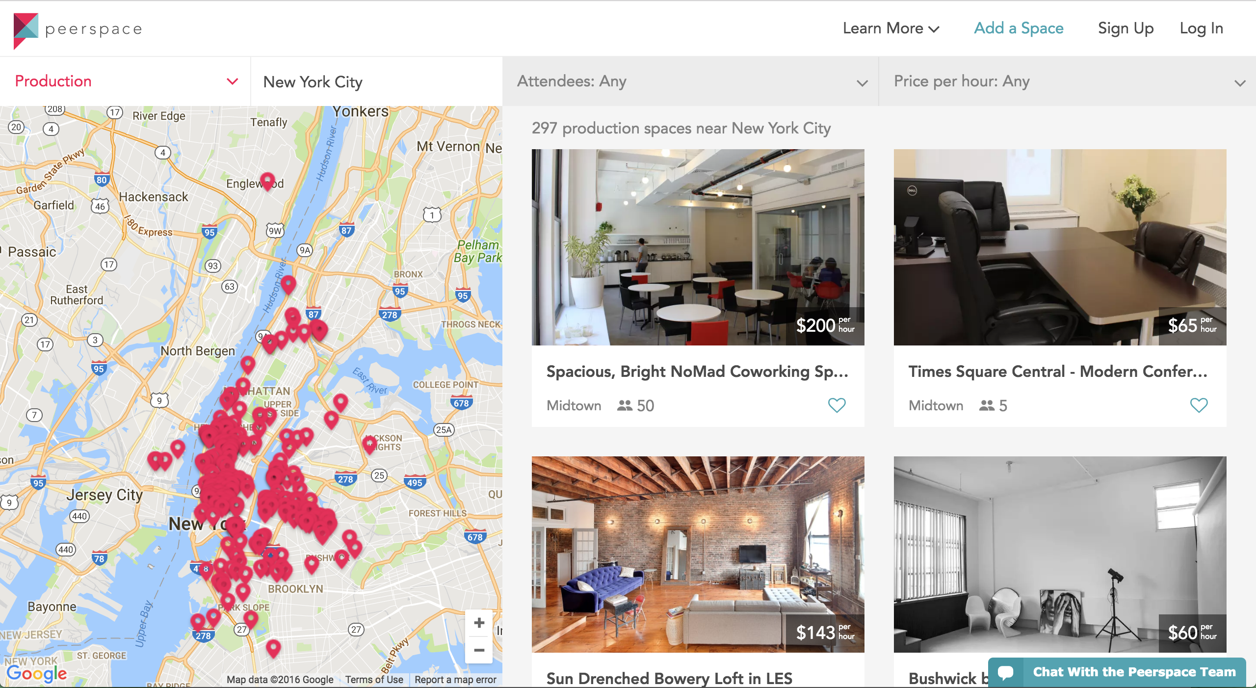
The web design is full of subtle pastels with stylized headings that create an explicit theme of their business. Some people might think that there is no reason or little rhyme to place these elements but this randomness equally adds a sense of more quirky personality that is at the heart of the brand.
Design #8 – Swatches
Swatches is a recently launched website by an independent iOS developer. The web design is full of vivid activities. It gives out a more accurate and fun color picker for the real world. For anyone who uses iPhone camera, Swatches let you accurately capture all the colors that the user come across in their daily life.
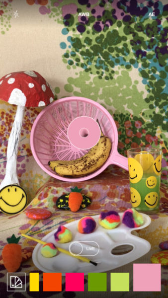 | 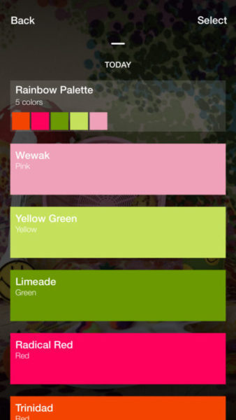 |
With swatches design layout, you can then also get information regarding the color such as the nearest paint, RGB, Pantone, and Hex values. As an added benefit you can also share the palettes and swatches with clients or friends. Color based web designs play an important part in attracting users to your website and your business eventually. This simple and colorful web design is great to add enthusiasm, charm, and art to any kind of business website.
Design #9 – Andrew Lindstrom
The design element of a website is not just limited to graphics but sometimes the typography can also be the sole appealing element of a good web layout. Andrew Lindstrom is one of the best examples of such web designs.
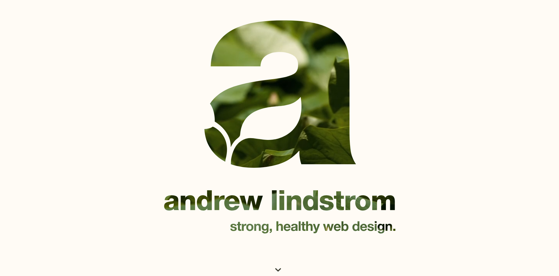
Good or unique typography greatly helps people to make their text readable on their website. There is a range of possibilities when it comes to making typography inspiring as well as unique in its own way. Good typography is the ultimate art and thus, one of the most creative ways to present content online.
Andrew Lindstrom is an excellent example of simplicity and creativity. It has great functionality and ease-of-use for users. It is a layout that can be adopted by all kinds of businesses.
Design #10 – Tej Chauhan
Tej Chauhan is another example of turning impressionist artwork into a more business model. The web design is highly intriguing. Every image on the homepage of the product developer slides out and properly covers the previous image. This offer very little context surrounding the object you see in front of you.
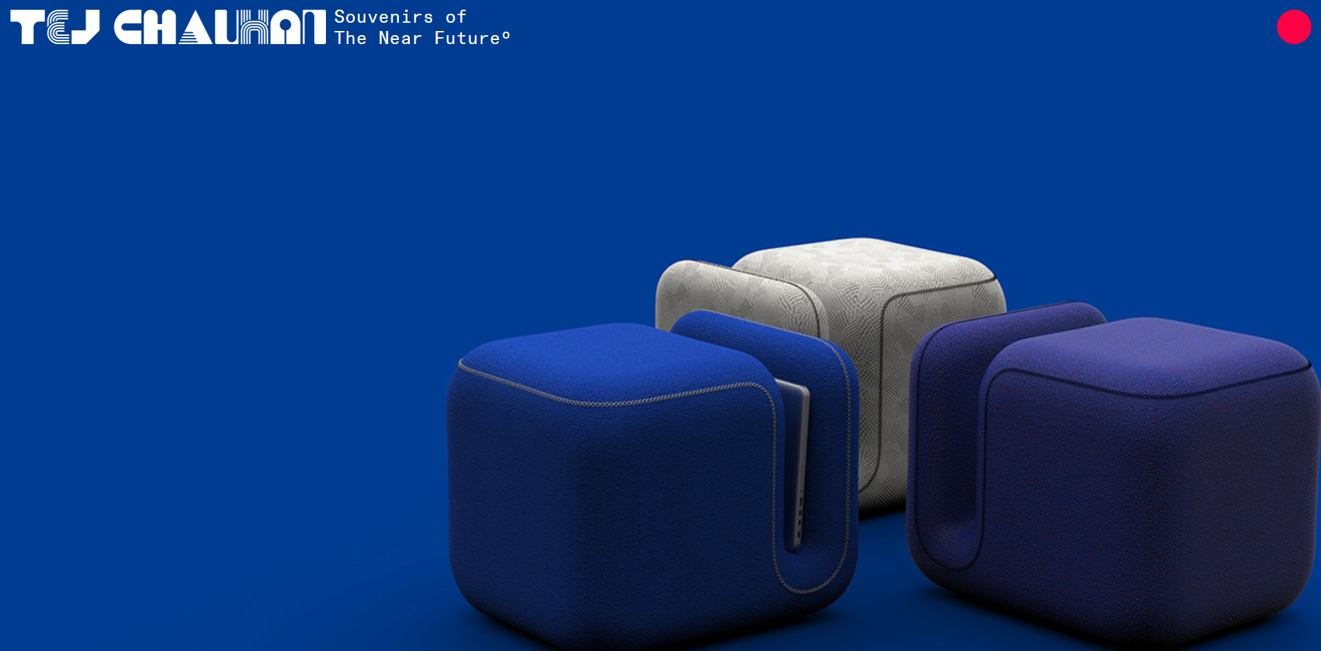
While you might be wondering why a business homepage would contain so much little context, isn’t this lack of context exciting to make you learn more about this? The homepage as the tagline ‘Souvenirs of The Near Future’ that suggest that these objects are just part of their large product line. In fact, it shows it as an opportunity to bring these innovative items into your life.
Tej Chauhan is one of the best examples of simplicity with uniqueness. It entices you to learn more and to navigate through the website as intended by the website owner.
Conclusively, your web design dictates your visitor where to focus on your website and what action to take. So all you need is to have a unique idea for your website and the consultation of an experienced professional to turn your creative imagination into absolute reality.


